
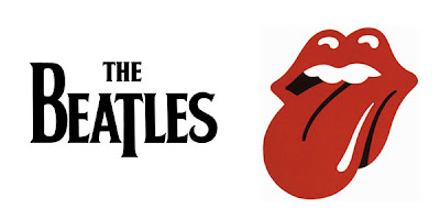
A Tale of Two Rock and Roll Band Logos
 |
| Both logos came from FamousLogos.us |
First, The Beatles. It's interesting that Ringo can be attributed to some of the more quirky tidbits of Beatles history; he coined the phrase "a hard day's night" which became the name of The Beatles' first feature film and corresponding song. He's also responsible, in part, for the manifestation of the logo, which made its debut in 1963 but still looks quite contemporary today. In fact, the logo doesn't really follow any highly recognizable fonts of the late 50s/early 60s, which keeps it timeless--just like The Beatles' music.
The logo came about when Ringo Starr and Brian Epstein, The Beatles' manager, visited a London drum store called Drum City in April 1963. Ringo originally had his heart set on an all-black drum kit, but was quite taken with a swatch of Ludwig's new oyster black pearl finish on the front desk. It was only available on the Ludwig brand of drums and the store's owner, Ivor Arbiter, had one Ludwig Downbeat kit with the finish in stock, for the hefty price tag of £238.
Epstein balked at the price. He offered to trade in Ringo's old drum set for the Ludwig set. Arbiter agreed on the condition that the Ludwig logo appear on the bass drum, as he recently had struck a deal between the manufacturer and his store. Epstein counter negotiated that The Beatles' name had to appear on the bass drum as well.
That led to Arbiter quickly sketching out an impromptu logo for the band--featuring an elongated "t" to emphasize the word "beat" in Beatles. Amazingly, Arbiter was paid only £5 for his graphic design work--a logo that was soon to become famous the world over. A local sign maker named Eddie Stokes perfected the design and painted it onto the drum kit.
 |
| Photo taken by Gordon Baer, via BeatleSuits.com |
So maybe Ringo wasn't responsible per say for the design of the logo, but if it hadn't been for the drum mishap, who knows how it might have been interpreted differently. It's clean, basic, classic and instantly recognizable. Needless to say I think Mr. Arbiter got gypped! Here's a really great news clip on the story of Ringo's drums and how The Beatles' logo came to fruition:
The Rolling Stones' logo may be a contrast of sorts compared to The Beatles--for starters, it's a symbol, not incorporating the name of the band or any letters for that matter. Where The Beatles' logo is black, The Stones' is red, a color indicative of passion and energy. It's also a depiction of one of the most sensuous and sensitive parts of the human anatomy, the mouth. Right away I think you can see where we're going with this...
| Variation of the logo from RockWriteListen |
"I wanted something anti-authority, but I suppose the mouth idea came from when I met Jagger for the first time at the Stones’ offices. I went into this sort of wood-panelled boardroom and there he was. Face to face with him, the first thing you were aware of was the size of his lips and his mouth."
But it also goes a little deeper than that. The tongue is said to represent the Hindu goddess Kali, the goddess of everlasting energy. That may have been a prophetic element, as The Stones are celebrating their 50th anniversary this year.
I also think the timing of this logo's debut is worth noting; it's far too suggestive for the Kennedy era and would have caused a controversy had it been created in 1963. As it was, by 1970 we were in the throws of the sexual revolution.
Throughout the years, the tongue portion of the logo has received graphical treatment from other artists, who have incorporated the Union Jack, American flag, and other elements into the design.
These two awesome logos for two awesome bands have endeared through the decades and are instantly recognizable. What are your favorite logos in music history?


I teach near Dachau and was shocked by a student wearing a Kiss t-shirt. This was 2010, mind. I immediately noticed the old 'SS' form of the logo which copies the lightning flash of the Schutzstaffel and which is illegal in Germany. Neither he, a German student, nor anyone else noticed.
ReplyDeleteBefore Keir makes a mountain out of a molehill let me state the following. There IS such a thing as coincidence - and the SS in KISS resembling the SS of the Nazis is just that - coincidence. Both Paul Stanley and Gene Simmons of KISS are Jewish so I hardly think they had Nazis in mind with their logo.
ReplyDeleteHaving said that I believe the KISS logo is much more recognizable than either The Beatles' or the Stones' logo and is one of brilliant simplicity and powerful design as befitting a hard rock band.
It is indeed a coincidence. Here's what Wikipedia had to say about the KISS logo: "Frehley created the now-iconic logo, making the "SS" look like lightning bolts, when he went to write the new band name over Wicked Lester on a poster outside the club where they were going to play.[20] The runic letters happened to look similar to the insignia of the Nazi SS, a symbol that is now illegal to display in Germany. Therefore, to avoid controversy, since 1979 most of the band's album covers and merchandise in Germany have used a modified version of the logo instead, with the SS represented by two backwards Zs."
ReplyDeleteI'm not a KISS fan but I would agree that it's a recognizable logo; however, I love that The Stones' is a symbol without any letters.
JZ--I like The Who's old logo, too. It was quintissential 60s.
ReplyDelete